
Photo By: Jacob Riis
Image Source: http://poulwebb.blogspot.com/2013/07/jacob-riis-part-1.html
Year Created: 1890
Principle 1: The use of lines from the desks converges onto the students and brings the eye directly into the classroom. It also forms a barrier to distinguish the students from the teacher. Even the lines written on the chalkboard express the same welcoming concept. It essentially draws the eye into a tunnel, with lines on both sides, and right out the window.
Principle 2: The texture on the walls elicits a gritty feeling. This conveys meaning. For example, schoolhouses from the 1800's were indeed old and rather gross. Also, the dust on the desks forms a texture as well. This specific use of texture makes the situation and photograph feel very realistic.
Principle 3: The depth of field is tricky in this image. It is definitely a deep depth of field, both the desk in the forefront and the children's heads in the background are all in focus. However, I think the teacher and the children's faces could have been more in the forefront to make this image more powerful. Yet at the same time, it would be impossible to fit all the elements in the photo if the photographer got closer.
I chose this image because the mere history interested me. I wanted to see the culture of the time and how our schooling today is vastly different. Also, all the people in the picture left me questioning what the exact subject was until I studied it a little more. The black and white definitely made this photo of great quality.

Photo By: Dorothea Lang
Image Source: http://www.loc.gov/pictures/item/fsa1998021556/PP/
Year Created: 1936
Principle 1: The feelings this image created are intense. It was during the Great Depression when most families were terribly poor. Due to the lack of money, the only option was to breast feed children. Also, the setting the mother is in is not ideal but the shows the struggle of the time.
Principle 2: The subject being the mother, has a pained and tired expression on her face. It looks like she is stressed and just trying to take each day as it comes. The wrinkles captured in her forehead really signify this. Also, her pose is effective enough for breast feeding but still slouched and tired. It looks like she has a lot of weight on her shoulders even though nothing is on them.
Principle 3: The exposure time of this image is somewhat slower in order to create a shallow depth of field. For example, the subject and objects in the forefront are very clear while the setting outside the tent is extremely blurred. The bruises on the tree are extremely clear while the background can only be made out to be a tree or bush in the far distance.
I chose this image because it emotionally struck me. The filth in the picture had me questioning why? Then when I found out it was from the Great Depression, I figured this image accurately represented the struggling time period. The mere detail in this picture had me examining every single aspect of it, leaving a sense of curiosity.
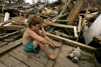
Photo By: Carolyn Cole
Image Source: http://www.emmitsburg.net/archive_list/articles/ce/misc/2008/pulitzer.htm
Year Created: 2005
Principle 1: The photographer clearly had a choice to use color here. The use of color was smart because the background would have blended together if it was black and white. Also, the color of the boy's shorts attract the viewer directly to the subject. However, other than the shorts, all the color is about the same, making it kind of dull.
Principle 2: The background is definitely cluttered, opposed to keeping it simple. However, the purpose of this photograph is to show the cluttered wreckage Hurricane Katrina caused. If the background was plain with only the boy, the complete story would not be told. Even though the background is so cluttered, it is all cluttered with the same material so the subject does indeed standout.
Principle 3: The rule of thirds has the boy placed in the left third. The next third that my eye is attracted to is the right one, with the stuffed animal. Because this third is much more empty compared to the other, the stuffed animal really stands out. As for the vertical rule of thirds, the top third is massive clutter and destruction while the middle third is still cluttered but now identifiable. The closest third is rather plain with one piece of simple wood. If the first third was as cluttered as the back, the subject would not even appear identifiable.
I chose this image because it shows that even the children affected by Hurricane Katrina were destroyed, not just homeowners. I liked that there is such a contrast between the subject and the objects. It initially struck me because the little boy is facing such adult troubles while his expression and posture makes him look like a man of the house.
No comments:
Post a Comment